Consumer Electronics
 Objective
Create a new initiative for homeowners and non-homeowners that would allow for their personal electronics to be covered in a repair plan.
 Problem
People often break or damage their electronic belongings, including their phones, computers and laptops, tablets, and/or TV's. However, under our current repair plans, we do not offer any solutions to help people fix or repair these issues – even though there is a glaring need.
 Solution
Create a new repair plan (called Consumer Electronics) that people can sign up for in order to help cover damage costs for their electronic belongings, such as phones, tablets, computers and laptops, and TV's.
Add a Device
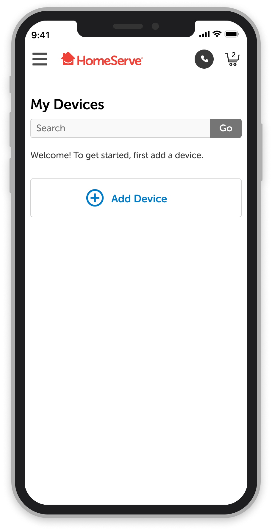
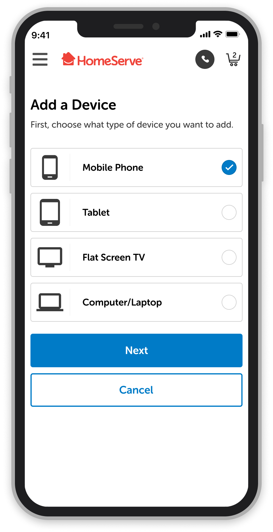
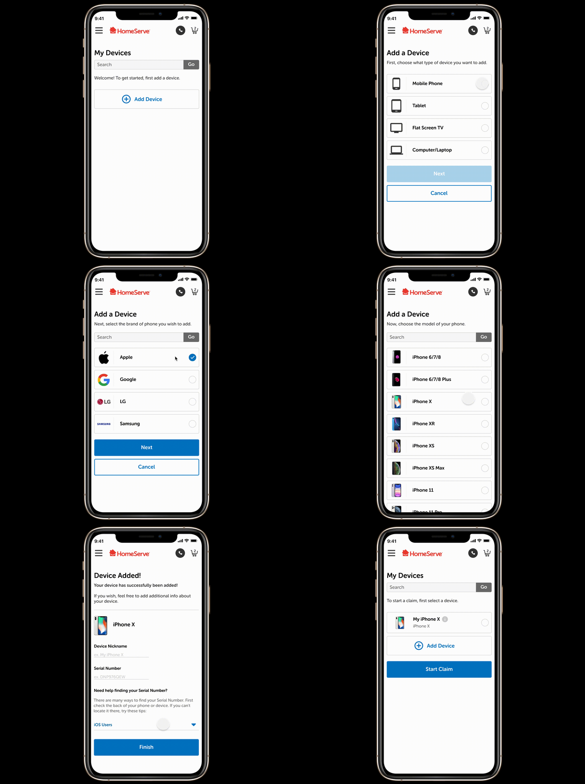
Before being able to file a claim, a customer must first add a device to their plan. This is the flow a user will take to add a device if they have never done so before.
Button Considerations: In most cases we decided to signify the inability to continue in the flow unless a selection was made by disabling the "Next" button (lowering the opacity as a visual signifier). Upon making a selection to continue the flow, the button would lighten up to its regular state.
However, you will notice on the final screen that the "Finish" button is never disabled, despite if the user leaves the "Device Name" and "Serial Number" fields blank. To align with our business goals, we decided that the most important step was to get a user to just add a device, even though a serial number is needed for them to actually file a claim. This creates a lower barrier to entry that meets the business goal need.
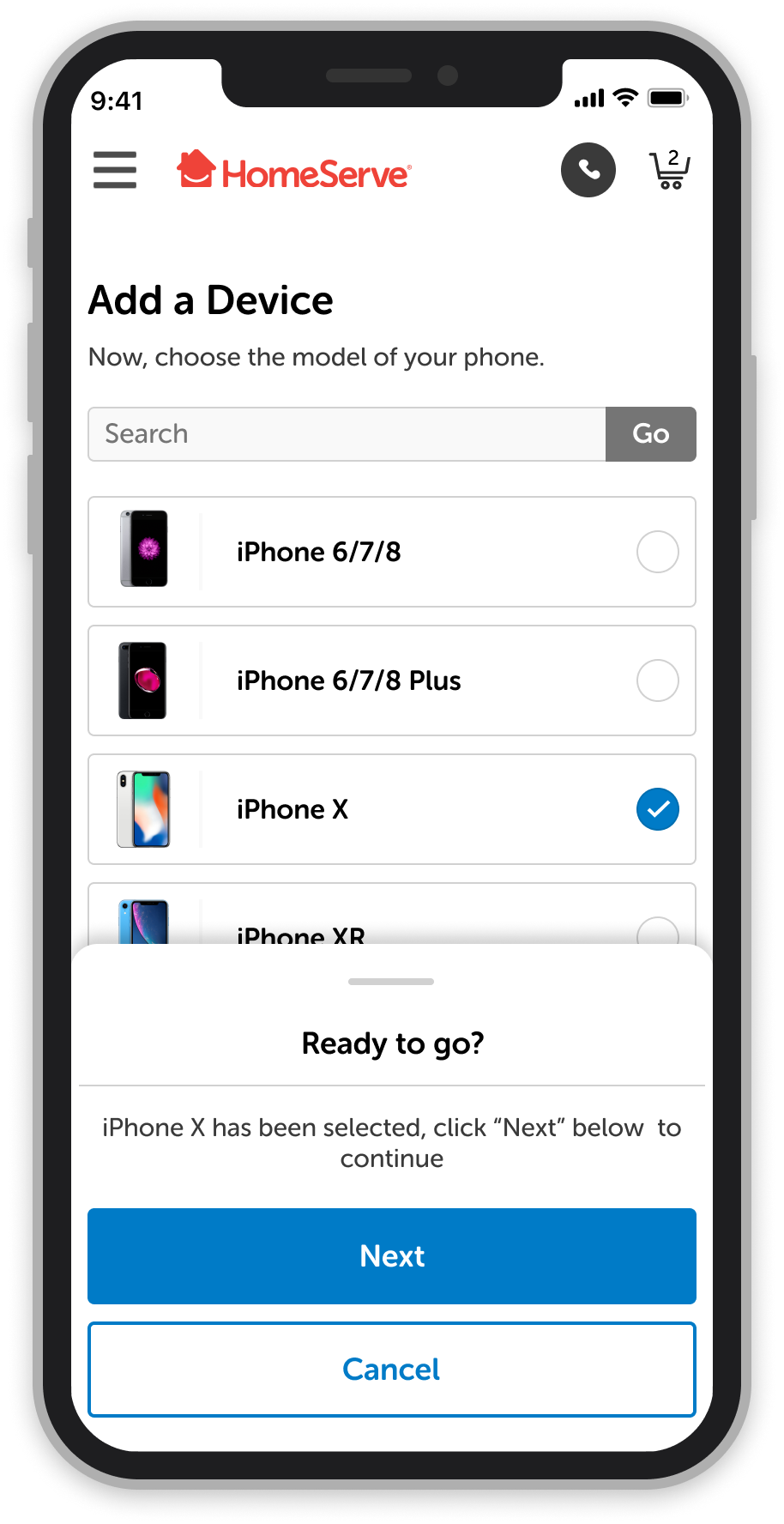
Another consideration we made was to add an accelerator to the process by adding a "Ready to Go" slide-up screen when the user selects their branded device. Because there are so many choices to choose from, the continuous scrolling would be cumbersome, knocking the visual representation of the user's selection completely out of view. As a UX best practice, it's helpful to see your selection while being able to confirm it in the same view.
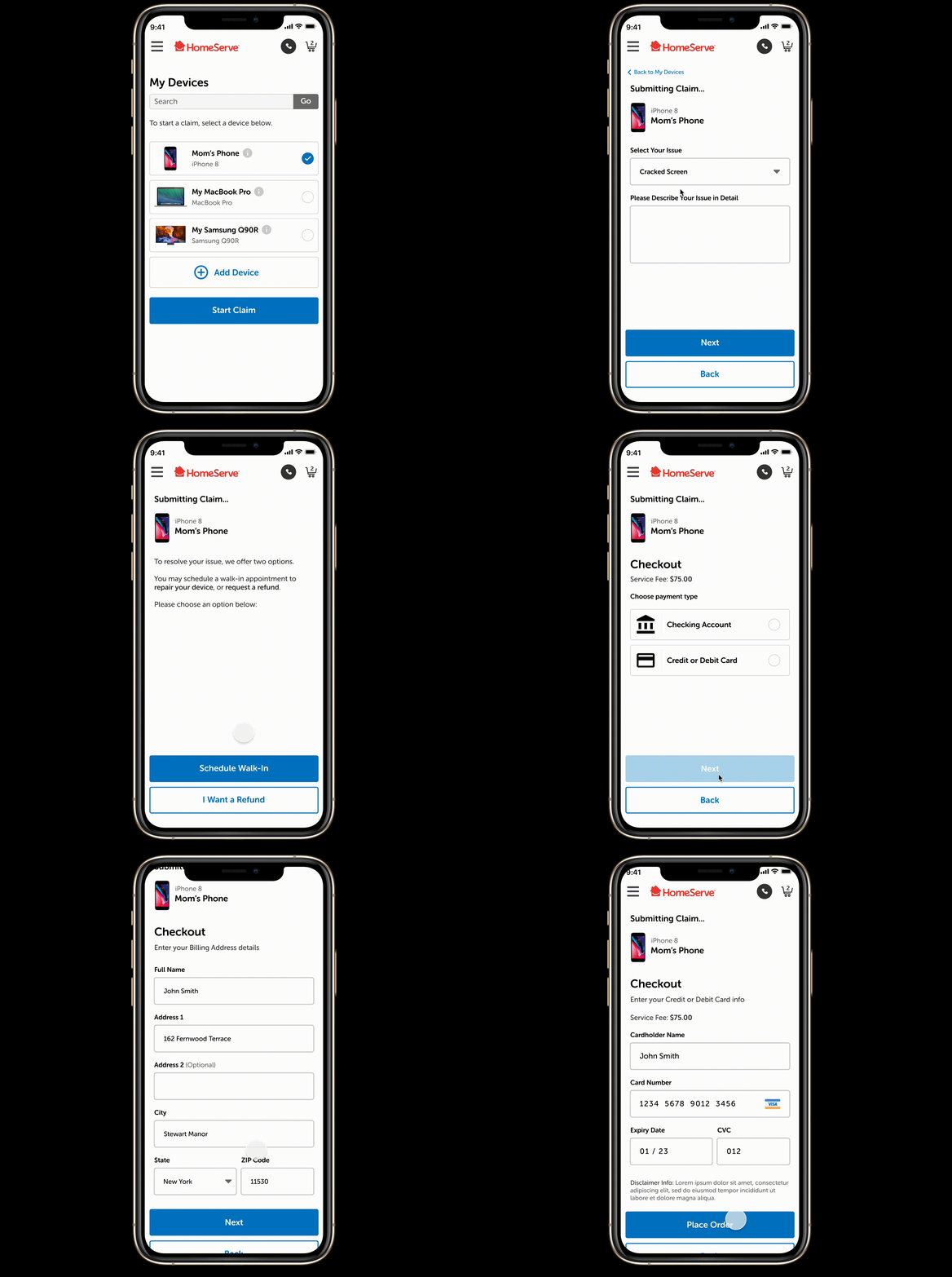
Scheduling a Walk-In Claim
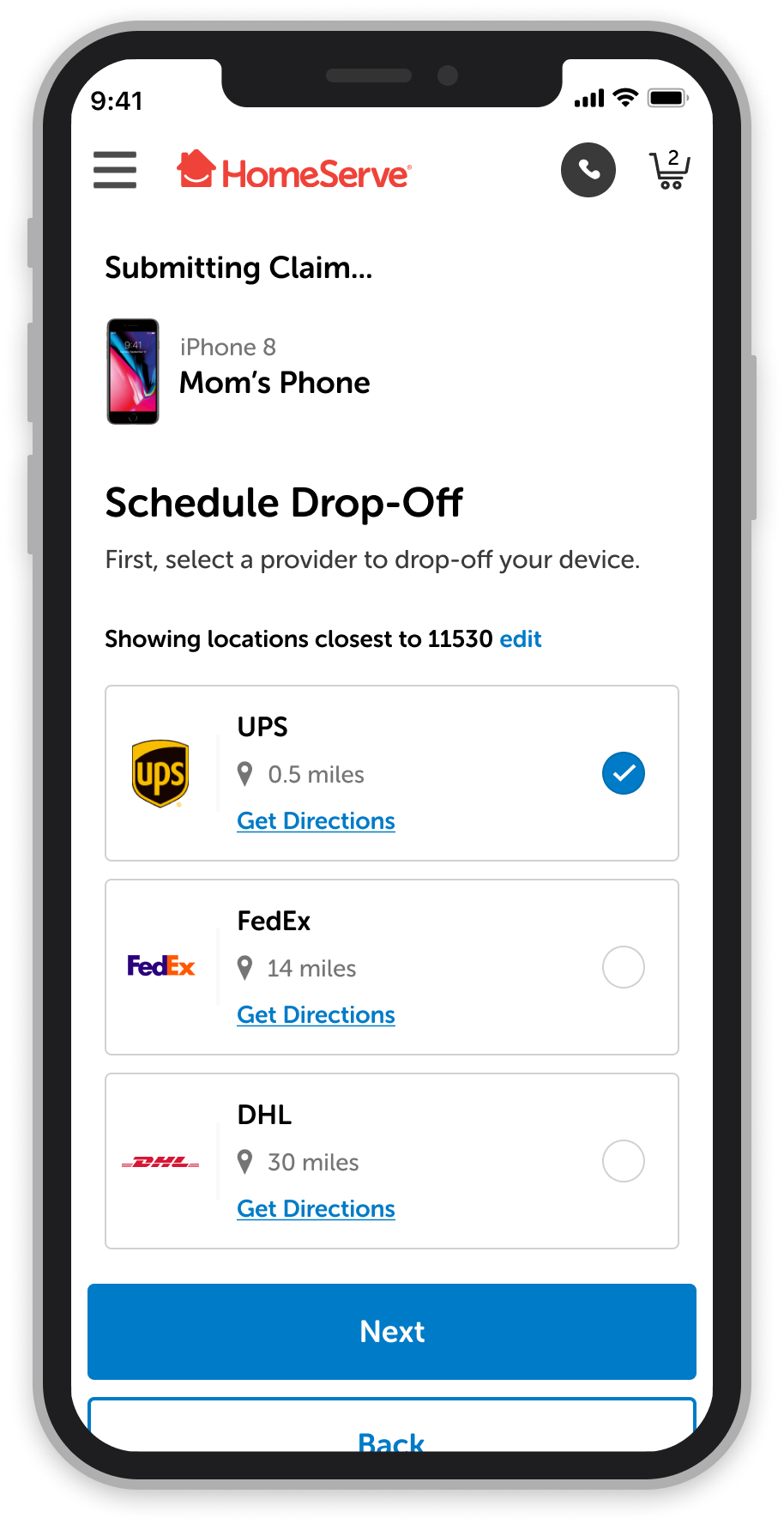
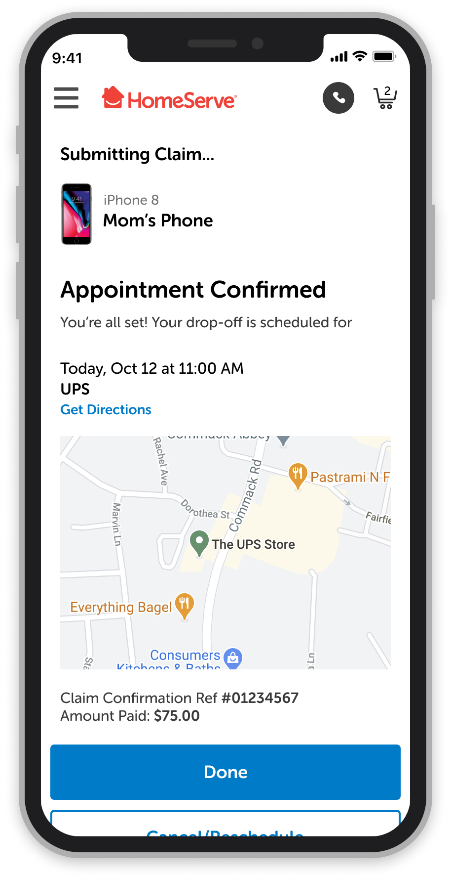
Once a device is registered to a user's plan, they have mutliple options to schedule a claim should an issue arise. This example flow is for a user to schedule an appointment to walk-in and drop their phone off to a partnered company to fix their device.
All details are to be put into the app so that HomeServe can take care of the costs, as well as to help make it a quick, seamless experience for the customer.
Issue selections are predetermined sets of data handled by our backend system. These are just examples of possible issues, not the ones we actually use at the moment.
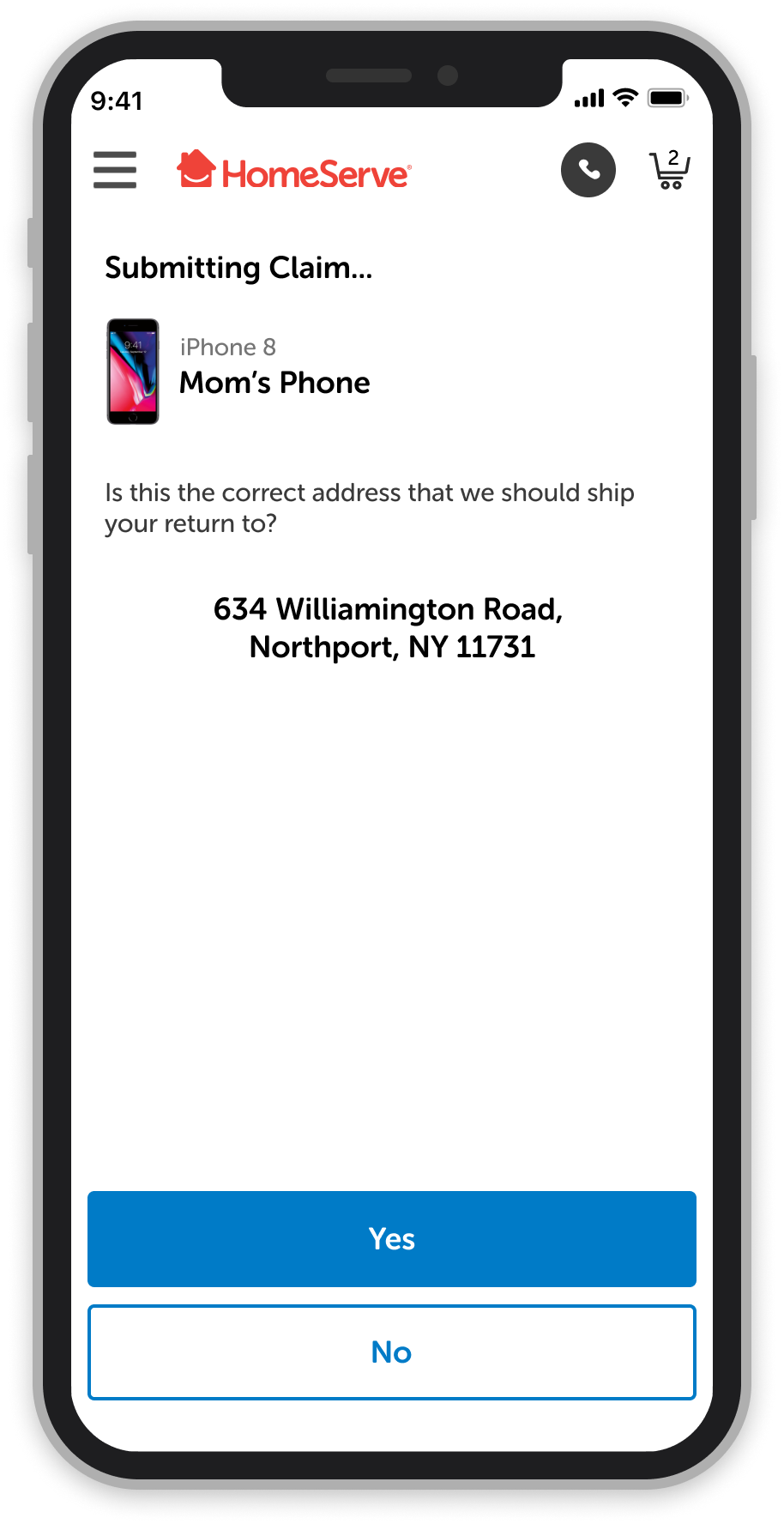
Prepopulated Forms: To help make it as easy and as quick as possible (the less clicks a user needs, the better!), we decided to prepopulate our forms with the customer's data that we have on file. It would be great if we could store payment options in the future, but that's not possible from our dev team at this point.
Along with prepopulated forms, we preselected things like closest location and the soonest available appointment time. Based on the team's research, customers want these everyday devices fixed ASAP in most cases. Obviously we give them a choice to choose their time, though, based on their own personal availability and preferences.
A small, but noticeable detail in the UX of the checkout process is the keyboard selection. Nothing is worse than being presented with a default keyboard during a task that involves only numbers (clearly one of my pet peeves! 🤣). We made sure to use the number-only keyboard for when a user is presented with entering number-only based details.
Fast-Paced, and Highly Collaborative ⚡
I primarily worked on the UI design for this project with another colleague. We spent a lot of time collaborating and "live co-working" in Figma together to create the hi-fidelity designs from provided wireframes. However, we were also tasked with making sure the flows made sense along the way..
Although I specialized in mostly UI design, I, along with many others – including designers, project managers, business analysts, directors, and software engineers – worked together to contribute towards Strategy, Product Thinking, Flows, Journeys, and even some Development. This was a very collaborative effort.
This project was concepted before it hit my desk, but once it did, our timeline was to push out wireframes, then get them approved, and finish up hi-fi screens (and get those approved) in a period of two weeks. There were over 80 screens that we had to tackle! This was all while working remotely with others that live across the globe. At times it can be challenging working with such a large group in different areas, but this is where communication and organization really show its value. Constant communication is key, but this type of atmosphere isn't specific to this project only – our company works in this manner all the time.
Prep Work 🗒
Status Cases: This is an example of our team's collaborative product thinking, where we brainstorm and work through the user journey to come up with all the service statuses that will need to be processed through the experience. Our business analysts and developers then go on to assign each status a code.
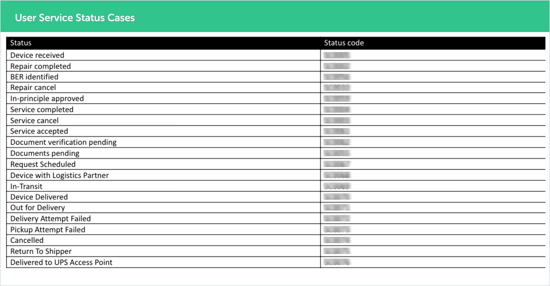
These are the status cases that we needed to design screens for.
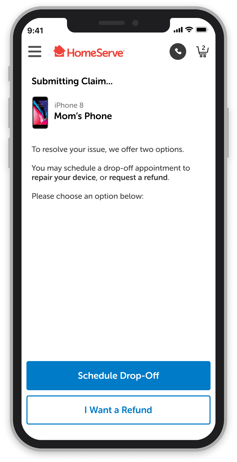
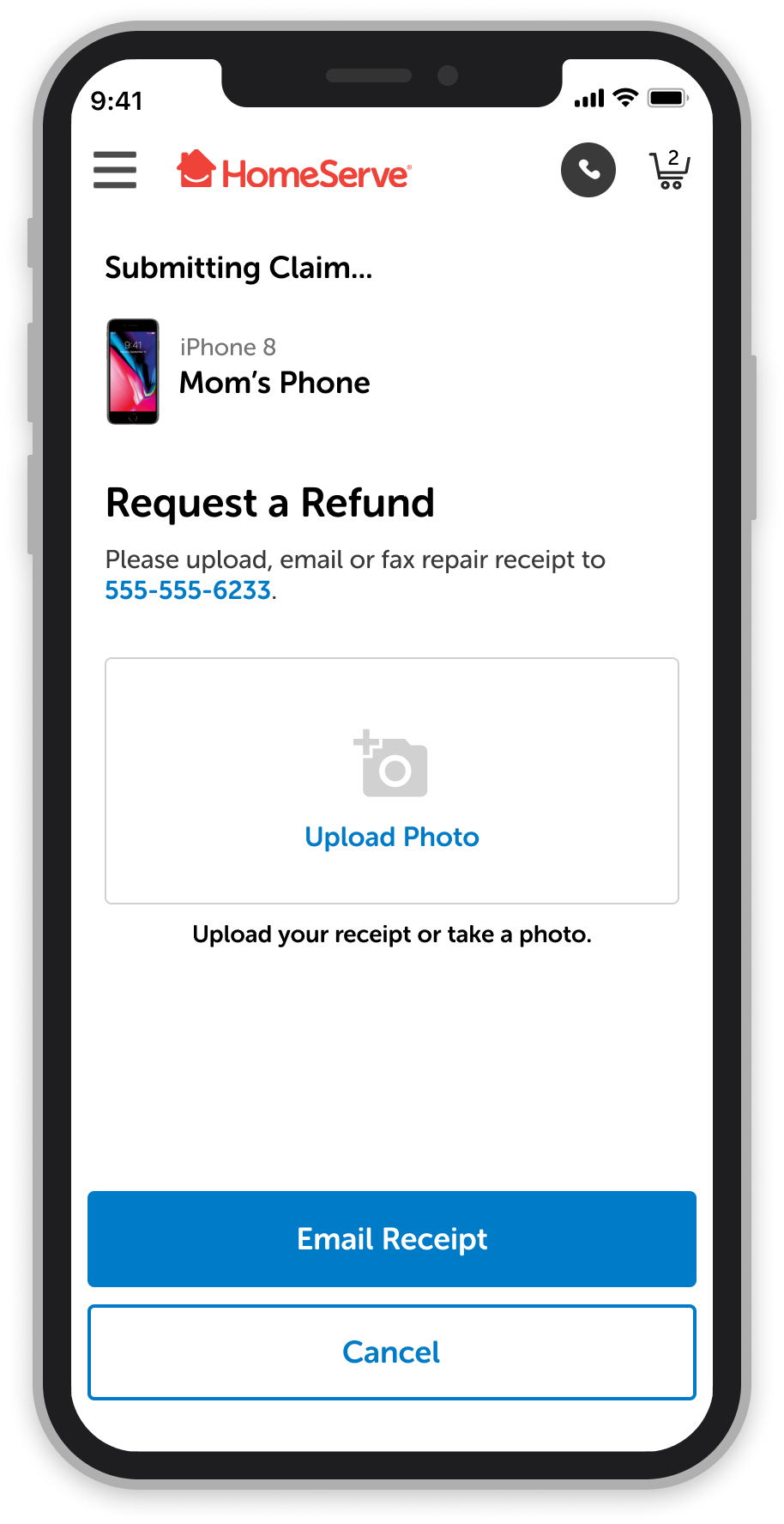
Task Flows: We brainstormed and created flows as a team before designing the screens for them. In this example, a user would submit a claim and have the choice to receive a refund or get their phone fixed/replaced by scheduling a drop-off appointment with shipping providers. This instance specifically designed with the COVID pandemic in mind, in which a customer can make an appointment and pay online to avoid contact with others.
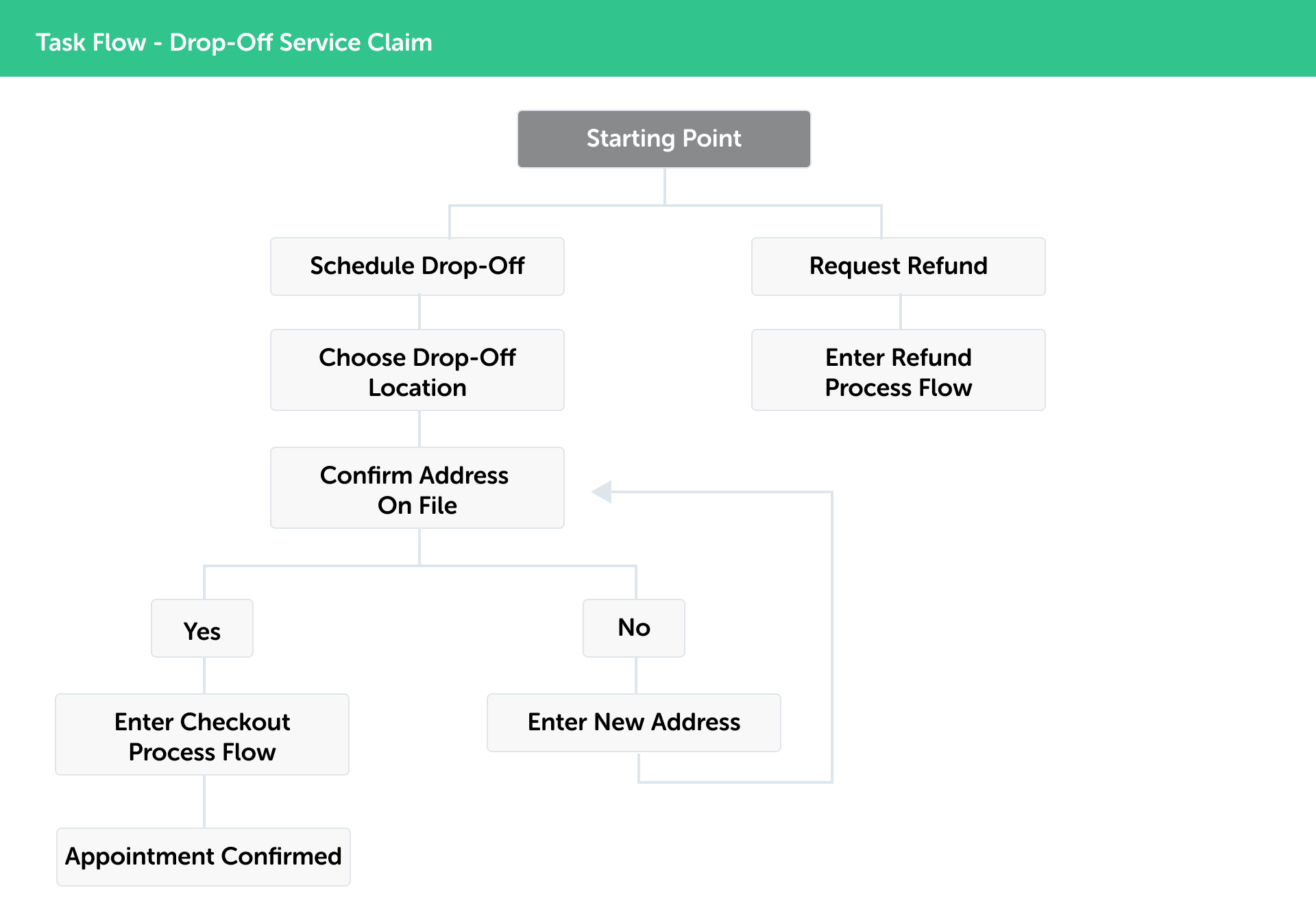
This is an example of just one abbreviated task that a user could take to schedule a drop-off service for their claim (this was COVID-specific).
Wireframes: This project was meant to be mobile-first, however the wireframes (which were provide to me) were all desktop-based. Here's an example of a few wireframes I received:
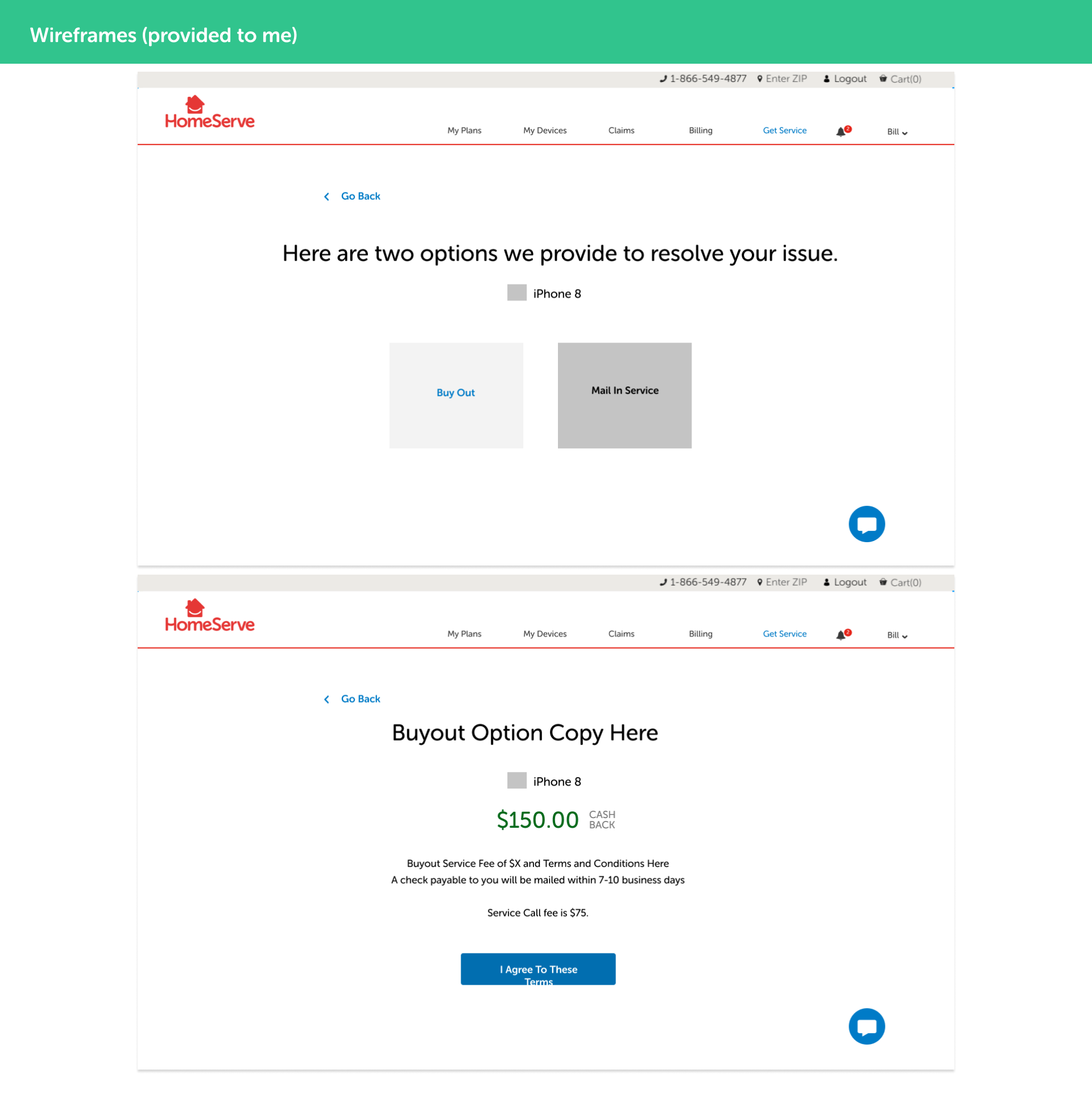
These are a couple wireframes I received. This was not my work.
A Few Weird Limitations 🤷
❌ Interwining Backend Platforms: Different backend platforms and technologies created some limitations with how we were able to design certain screens of the process. Users would be flowing through separate backends - intertwining the experience - which means we had to make sure the visuals looked consistent on both platforms and the flow was able to be consistent, despite being limited into what data was able to be passed between one step to the next. For example, overlays and modal boxes that could potentially collect data were not permitted in this design.
❌ Non Recognition: Due to system limitations, we are unable to recognize the type of device a user is on – this means that we had to display information in a general way rather than personalized. For instance, the screen below shows a user how to find their device’s serial number according to what type of phone they have. It would be a better experience if we only could show them what’s relevant to them personally, rather than making them search for what’s applicable to their specific case.
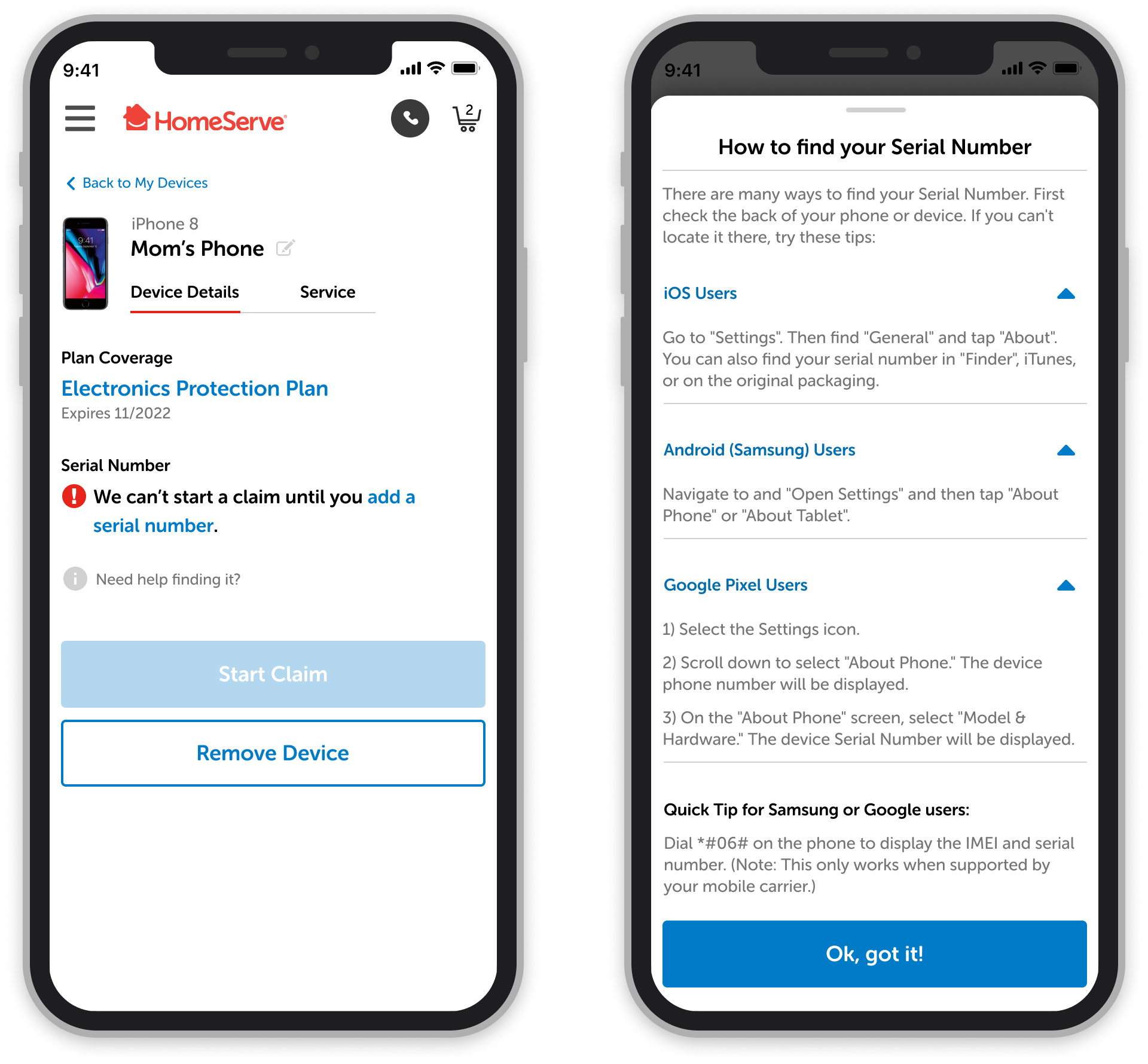
This screen shows a user how to find their device’s serial number according to what type of phone they have. It would be a better experience if we only showed them what’s relevant to them personally.
❌ Traditional Visual Looks: Although this was a new initiative, the branding, style, and "look and feel" had to stay consistent with what's used in our other designs. The obstacle here is that we could not make this more visually flashy since our other products have an older, more traditional style – we had to keep many styles and rules the same, even if they are a little outdated and don't follow best practices.
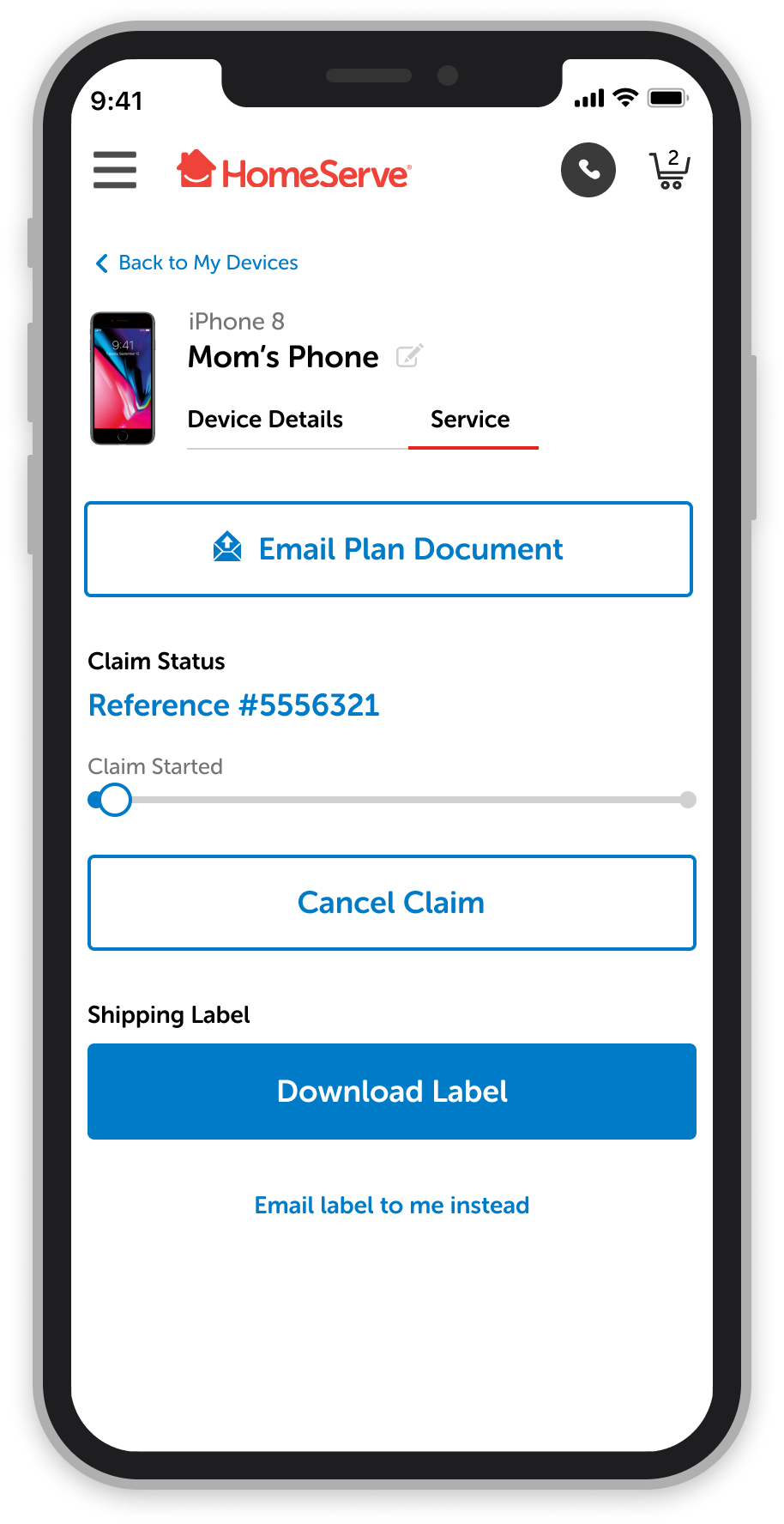
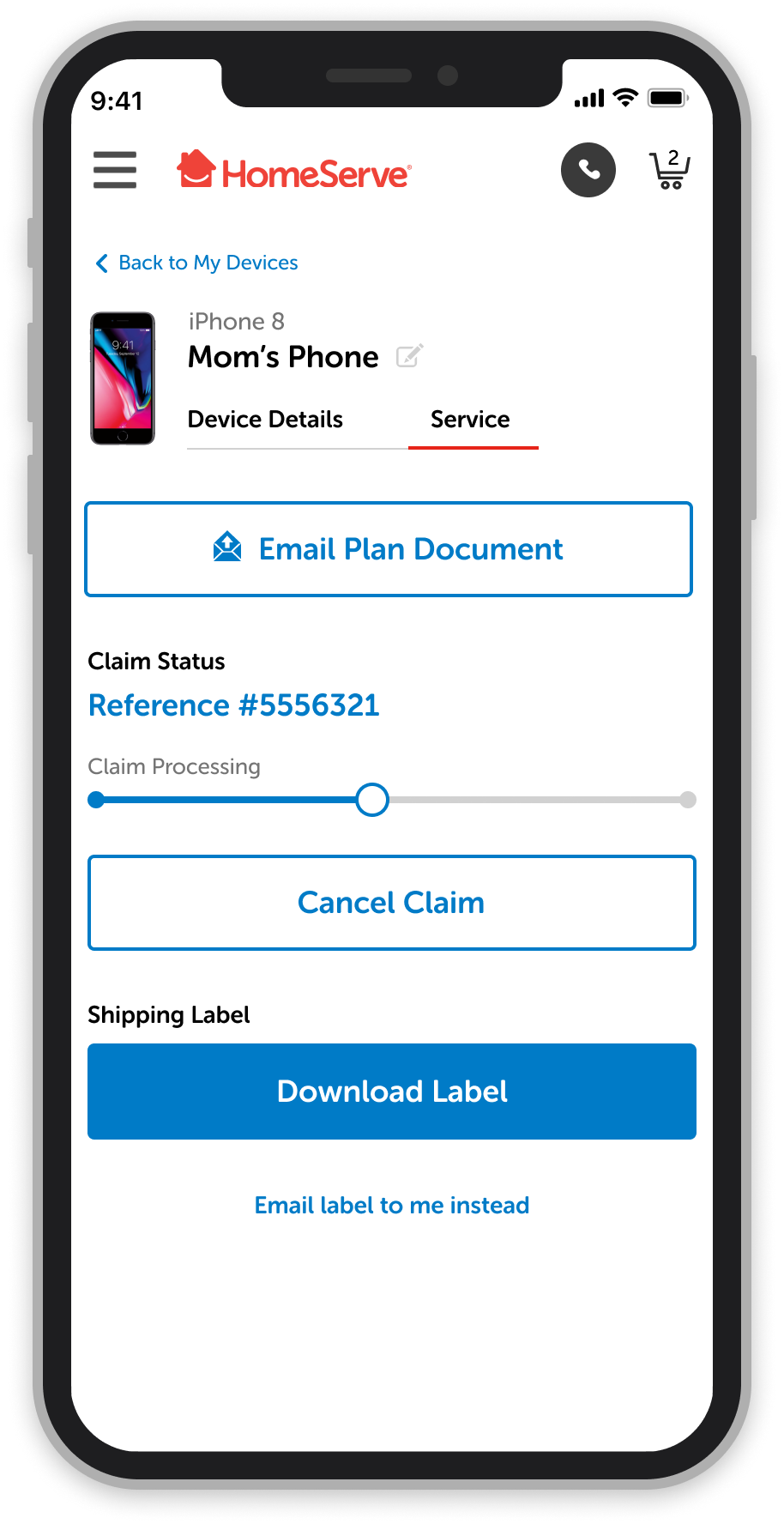
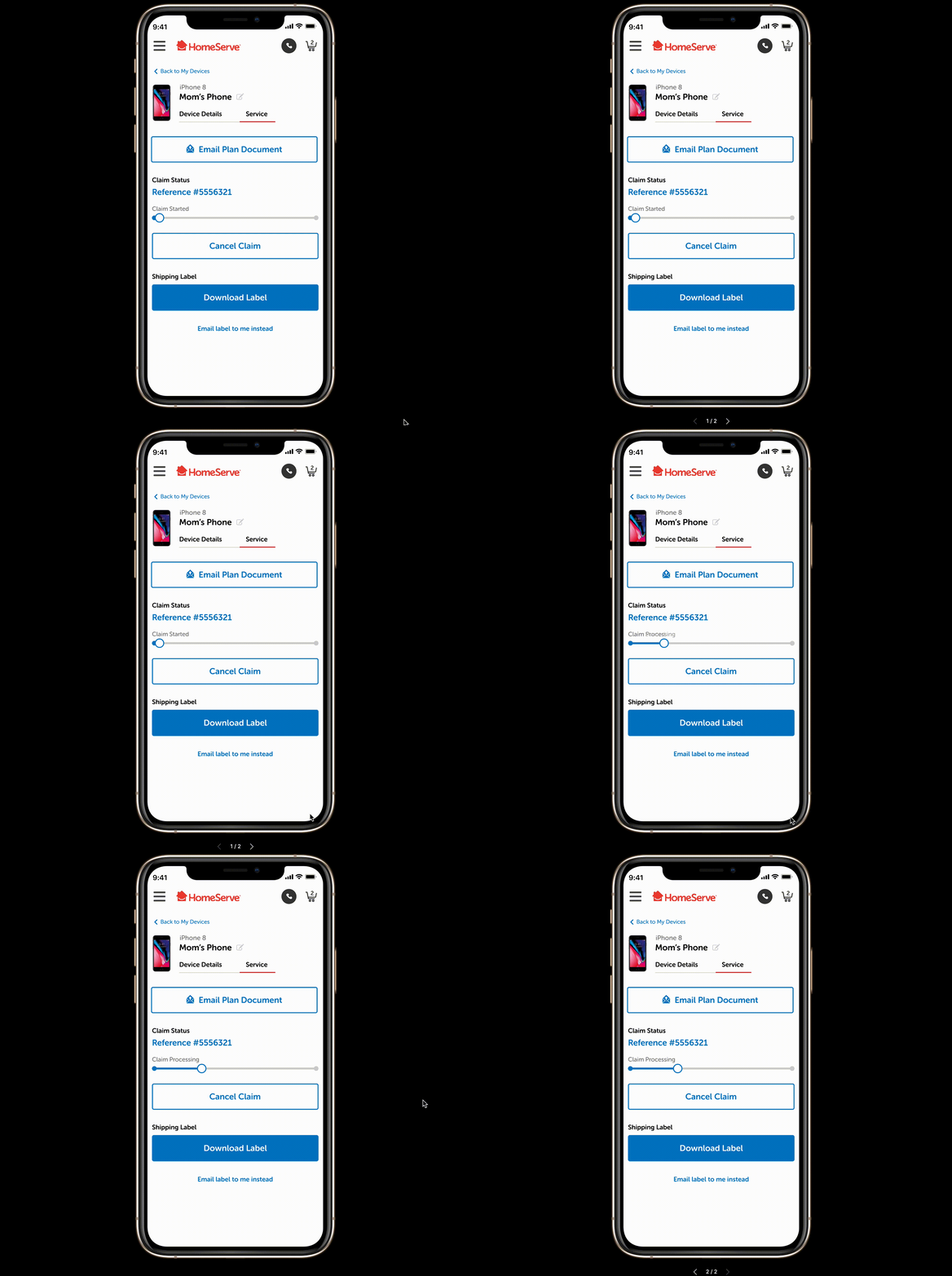
Processing Claim Progress Bar Animation 👇
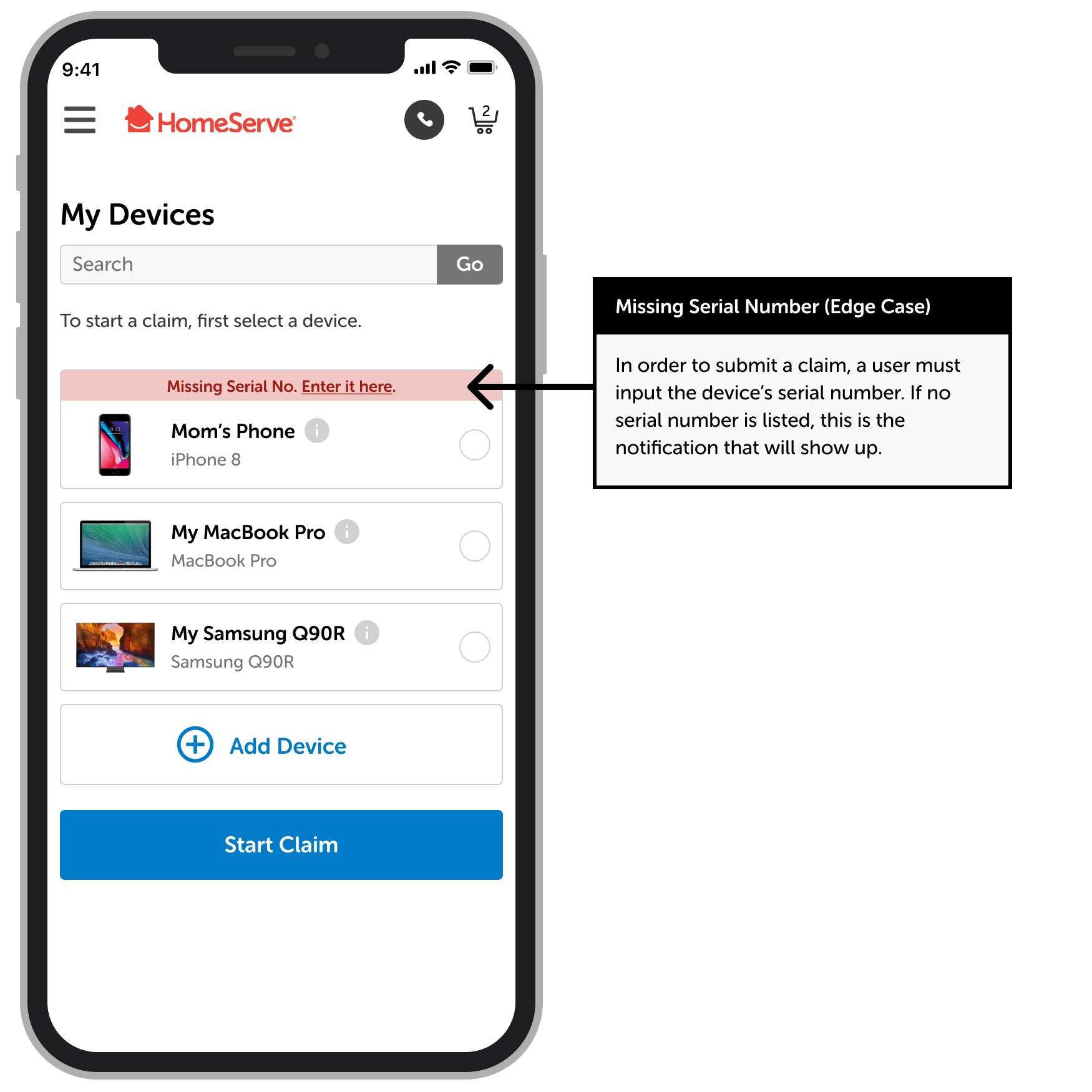
Edge Case Examples 👇
Benefit Amount Reached Animation
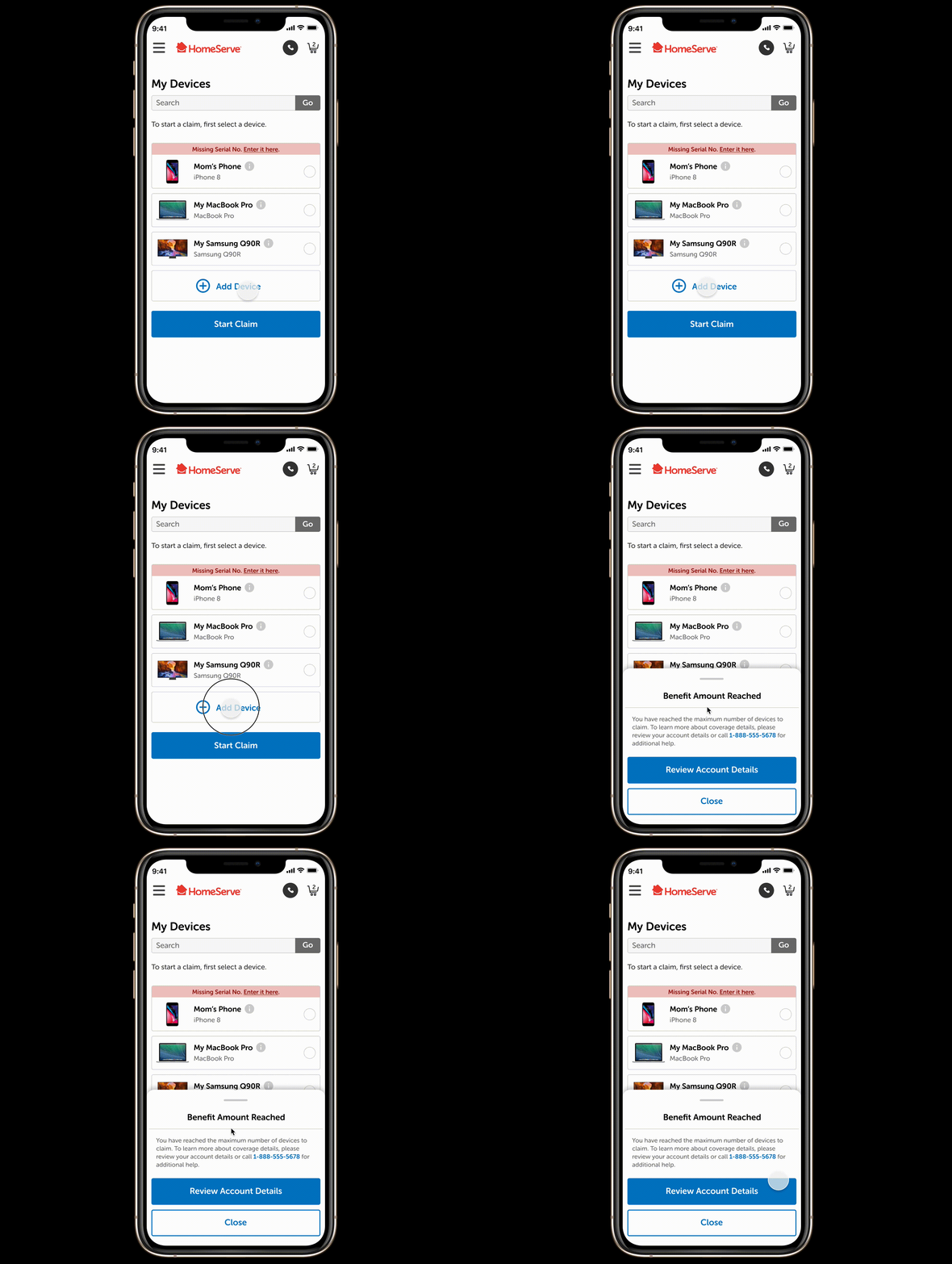
In some cases, users may reach their benefit limit and won't be able to add any more devices to their current plan. This slide-up notification is a subtle technique used to alert the user, rather than being a static message on the screen to avoid inducing a negative feeling of constantly being reminded that they can't do something.
More UI Screens
